Create a GroupBox Using HeaderedContentControl
While Avalonia doesn't include a built-in GroupBox control, you can achieve the same functionality and appearance using a HeaderedContentControl with custom styling. The HeaderedContentControl provides a header area and content region, making it perfect for grouping related interface elements.
Implementation
Add the following style to your application resources (typically in App.axaml) or to the specific Window or UserControl where you need the GroupBox functionality:
<Style Selector="HeaderedContentControl">
    <Setter Property="Template">
        <ControlTemplate>
            <Grid>
                <Grid.RowDefinitions>
                    <RowDefinition Height="Auto"/>
                    <RowDefinition Height="*"/>
                </Grid.RowDefinitions>
                <Grid.ColumnDefinitions>
                    <ColumnDefinition Width="Auto"/>
                    <ColumnDefinition Width="*"/>
                </Grid.ColumnDefinitions>

                <!-- Header -->
                <Border
                    ZIndex="1"
                    Background="{DynamicResource SystemControlBackgroundAltHighBrush}"
                    Padding="5,0,5,0"
                    Margin="5,0,0,0">
                    <TextBlock
                        Text="{TemplateBinding Header}"
                        FontWeight="Bold"/>
                </Border>

                <!-- Content Area -->
                <Border
                    Grid.RowSpan="2"
                    Padding="0,5,0,0"
                    Grid.ColumnSpan="2"
                    CornerRadius="4"
                    Margin="0,10,0,0"
                    BorderBrush="{DynamicResource SystemControlForegroundBaseMediumBrush}"
                    BorderThickness="1">
                    <ContentPresenter
                        Name="PART_ContentPresenter"
                        Padding="8"
                        Content="{TemplateBinding Content}"/>
                </Border>
            </Grid>
        </ControlTemplate>
    </Setter>
</Style>
Once the style is in place, you can use the HeaderedContentControl in your XAML:
<HeaderedContentControl Header="Settings">
    <StackPanel Spacing="8">
        <TextBox Text="Sample content"/>
        <Button Content="Click me"/>
    </StackPanel>
</HeaderedContentControl>
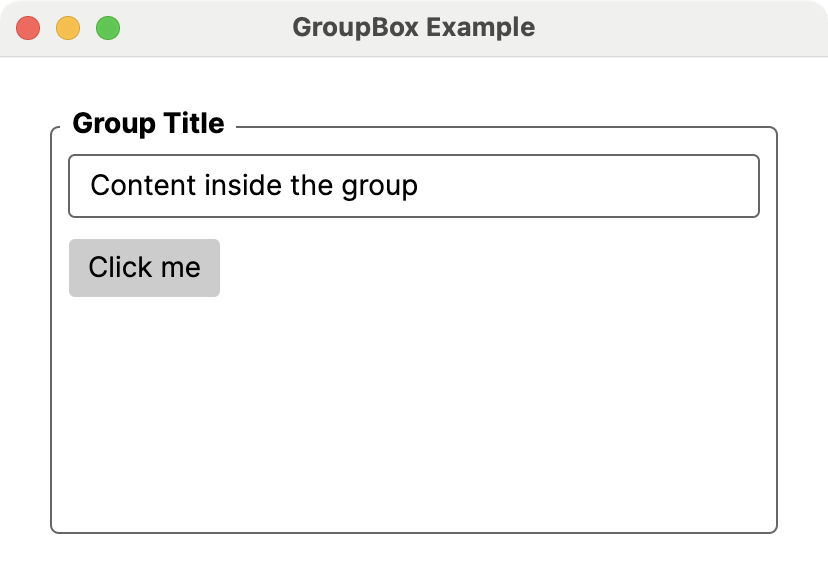
The style uses Avalonia's theme resources to ensure the control looks appropriate in both light and dark themes. The header text appears to "break" the border line by using a background color matching the window, creating the classic GroupBox appearance. The content area features rounded corners and proper padding for a modern look.
This implementation provides all the visual and functional benefits of a traditional GroupBox while maintaining consistency with Avalonia's design patterns and theme system.